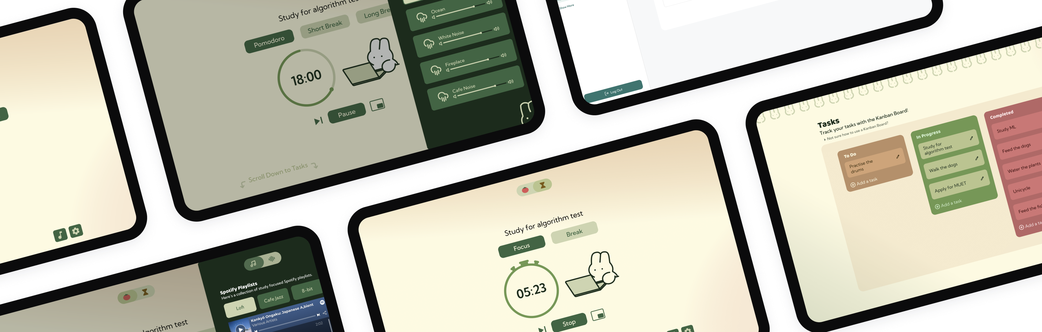
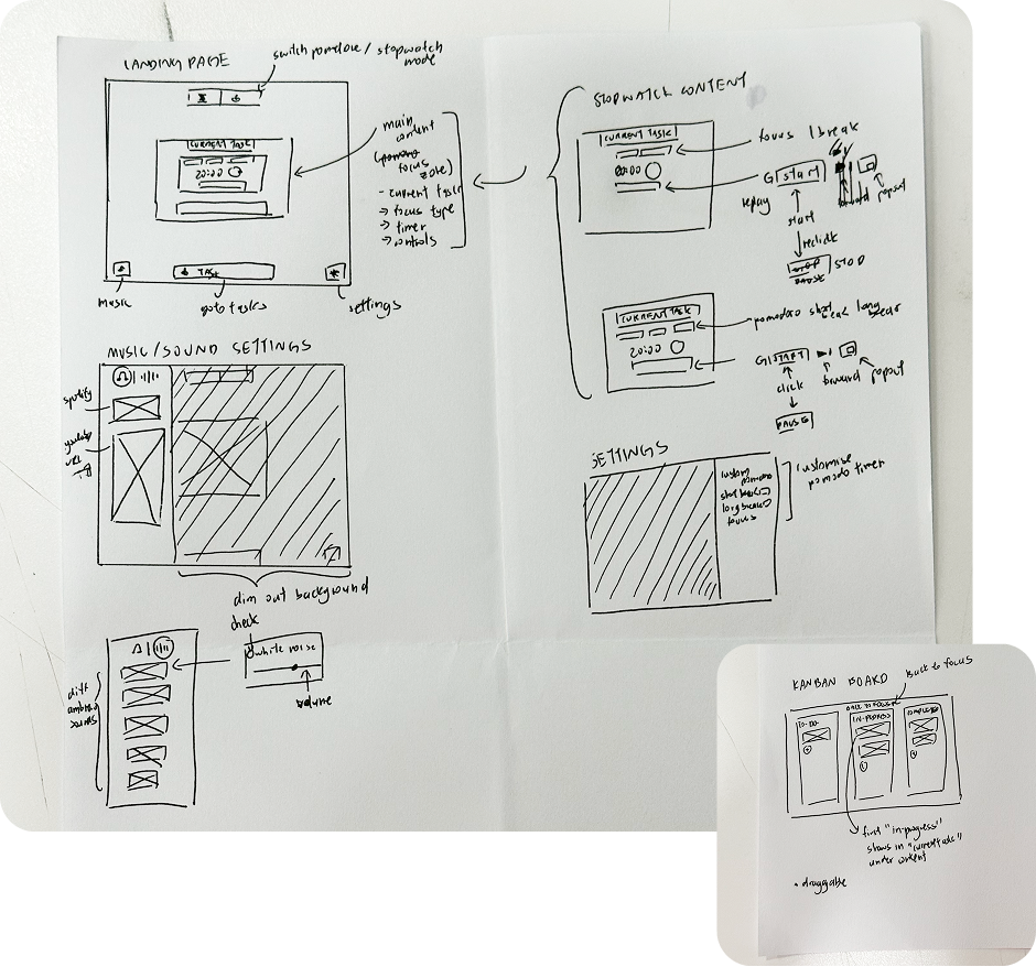
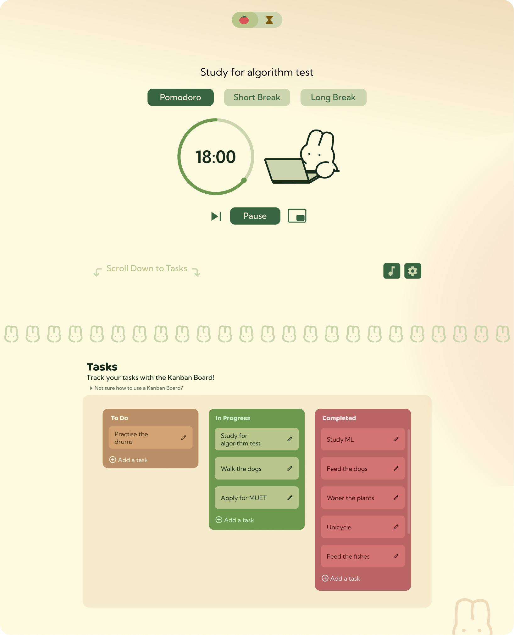
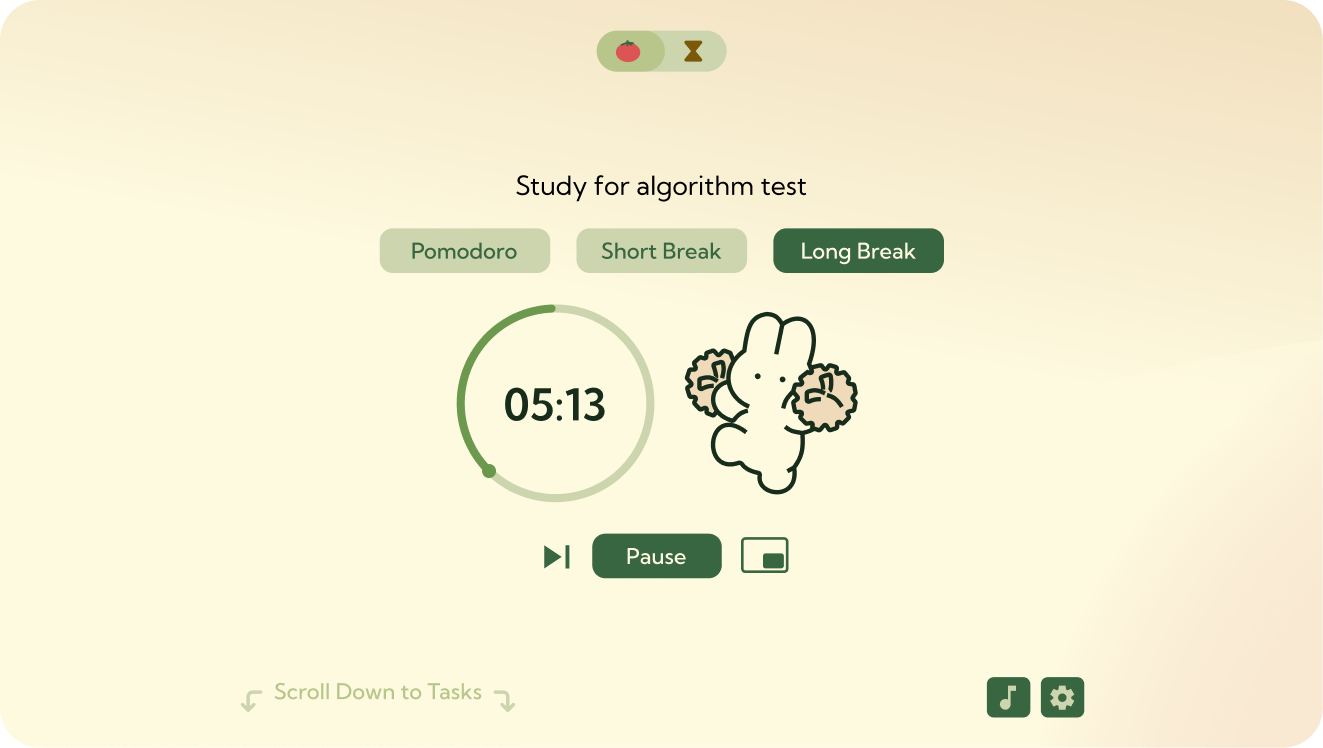
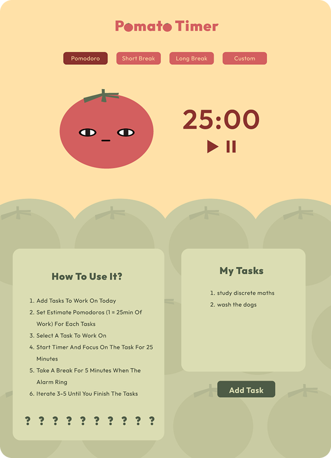
← Back to portfolio
Pomato

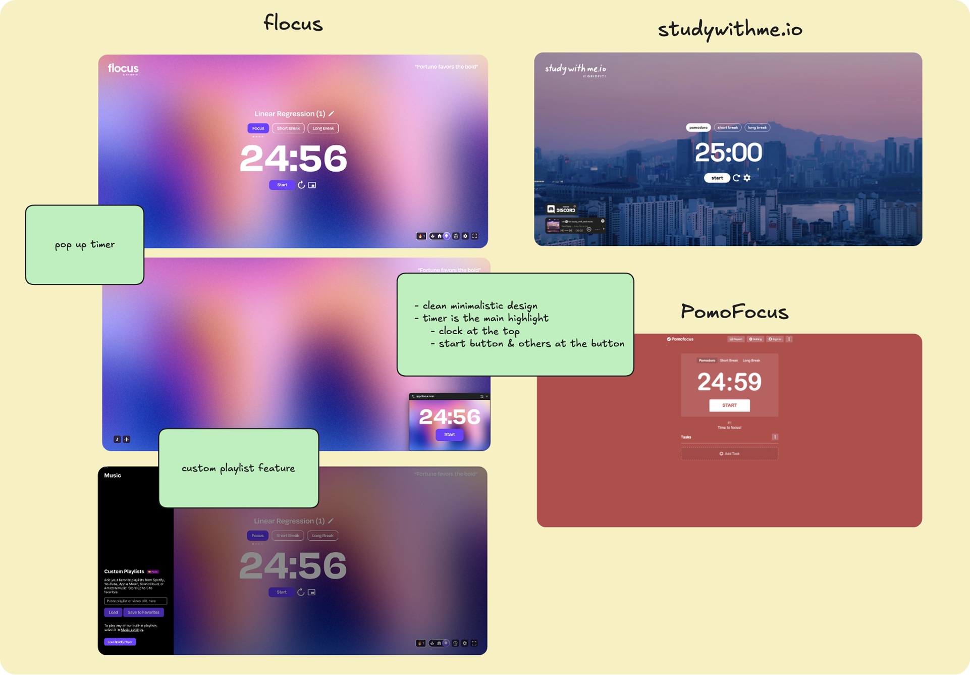
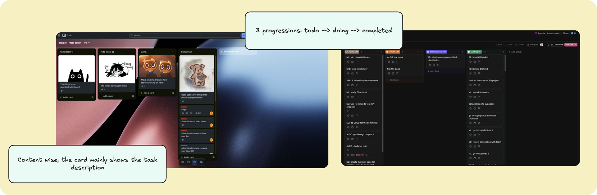
Fixing the Tiny Frustrations with existing Pomodoro Timers

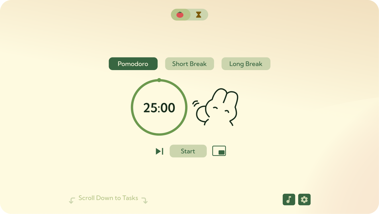
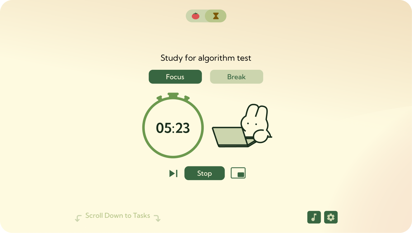
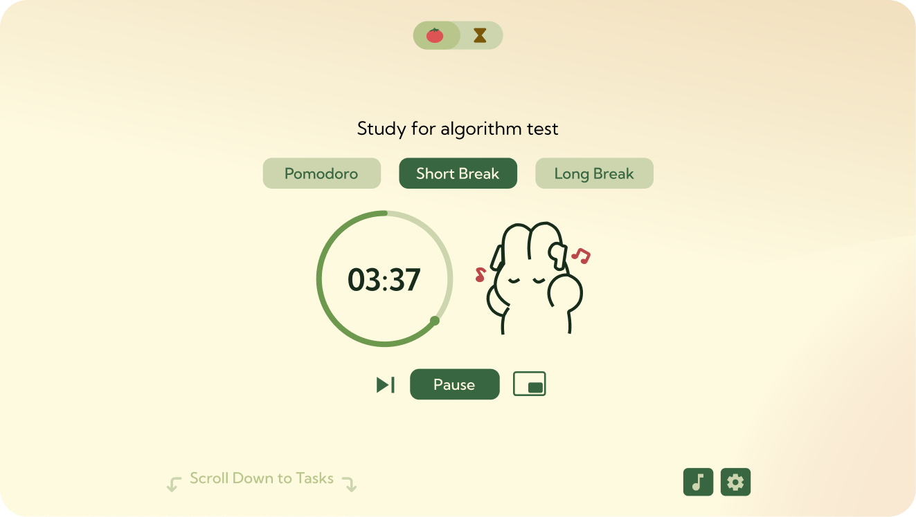
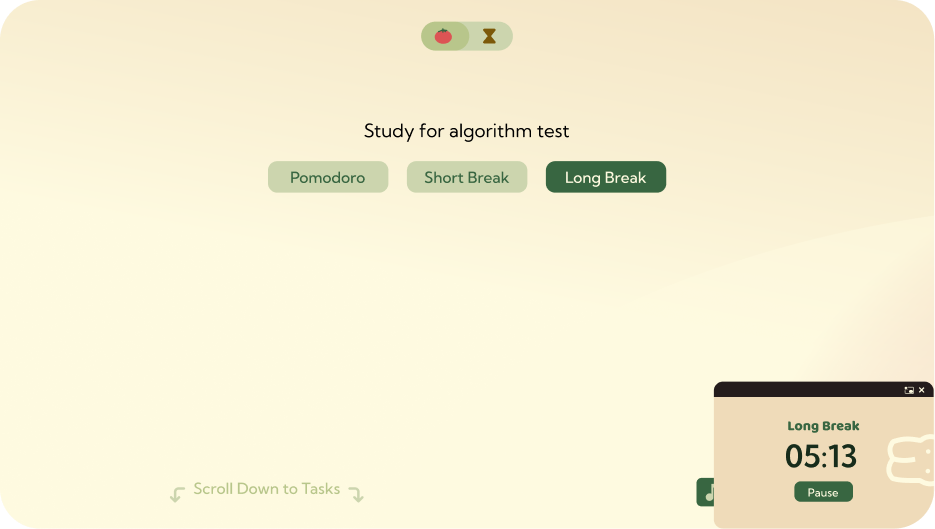
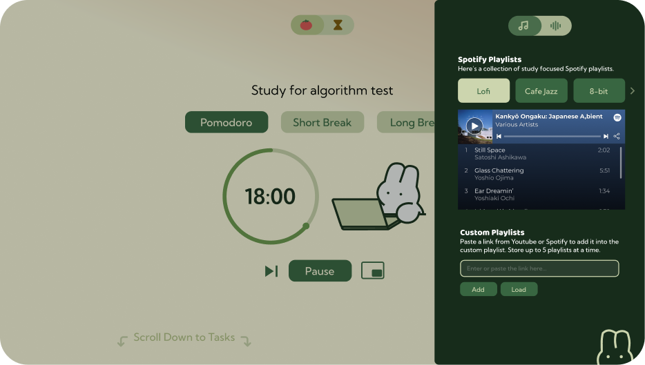
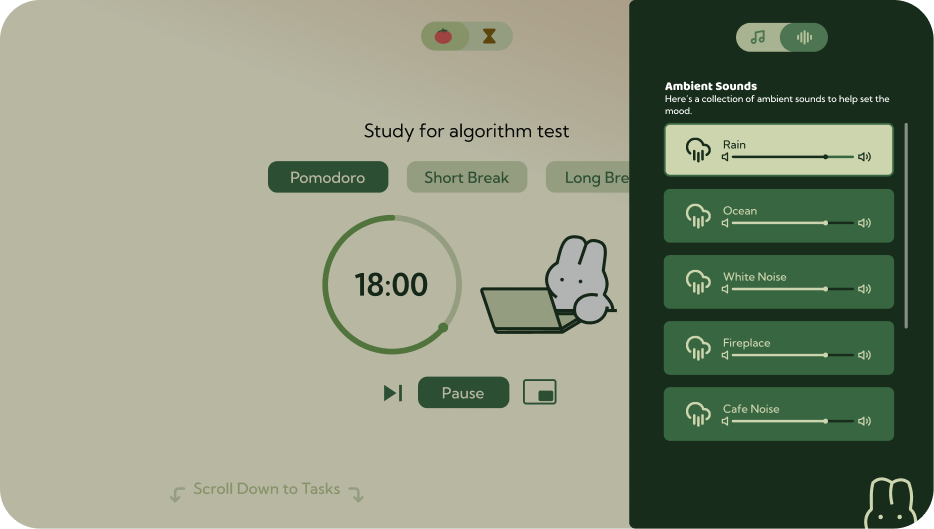
Pomato is a productivity web app designed to reduce context switching during focused work.

Instead of juggling multiple tools for timing, music, and task tracking, Pomato brings everything into a single, distraction-free workspace.

Pomato screen designs

Backstory

I could never find a Pomodoro timer app or website that really fit the way I work.
I always ended up juggling multiple tabs just to get the full experience:

And sometimes, a strict Pomodoro timer just isn’t what I need. Depending on the task, the 25/5 cycle sometimes feels too constricting.

Based on the problem, I gathered a set of features to build around it

Audio Options

Built-in ambient sounds and ability to add custom Spotify playlist

Task tracking

Kanban board to keep track of tasks and monitor progress

Floating timer

Small popup timer that stays visible as you work on different tasks or tabs

Flexible time modes

Customised Pomodoro timer

Change the focus or break time based on personal preferences

Stopwatch mode

Rewards you with breaks based on how long you worked

Now with the main features planned out, I did some research on existing websites

I’m looking to spot common layout patterns and get inspired by websites that are already nailing the features I want to build.

Pomodoro Timer
Annotated screenshots of existing Pomodoro timer apps: flocus, studywithme.io, PomoFocus
Kanban Board
Annotated screenshots of existing Kanban board apps
Hand-drawn wireframe sketches mapping out the landing page, music settings, stopwatch view, and kanban board

With a rough idea on everything that the Pomodoro website needs, I brought it to light through sketching out the draft

I used this to plan out the overall feel and look of the project, I also wanted to plan out the placement of features.

Now time for the fun part

Designing the Website!

  1. I kicked things off with a baseline design guide where I picked a color theme, chose fonts that fit the vibe, and made sure everything felt cohesive.
  2. Then, using my draft as a base, I designed the pages while also tweaking things as I went whenever I felt that something else looked or worked better.

What I learned from this

This was my first time starting with a real problem and building a project around it — instead of just designing for the sake of designing.

Before this, I’d always dive straight into Figma or other designing projects with no clear plan. Ironically, that took more time to come up with a design.

I’ve always wanted to build a Pomodoro site, but my first attempt took forever, and still didn’t fix the things I personally struggled with.

This time, the design came together faster, and it actually solved the problems I set out to fix.

It taught me that planning saves time and makes the outcome way more satisfying.

I also learned how much of a difference it makes to think about how users will use the product, not just how it looks.

Overall, it was a new process for me and honestly, a really fun one.

My first attempt at designing a Pomodoro timer
First attempt at designing a Pomodoro timer

Want to see more?

Check out my other work

Designing a University Forum Students Actually Used
View case study →